
In today’s digital landscape, mobile devices account for more than 60% of all web traffic. For service-based businesses seeking to generate leads, this statistic isn’t just a number—it’s a wake-up call. If your website isn’t optimized for mobile devices, you’re essentially closing the door on more than half of your potential clients before they even have a chance to learn about your services.
What Is Mobile-Responsive Design?
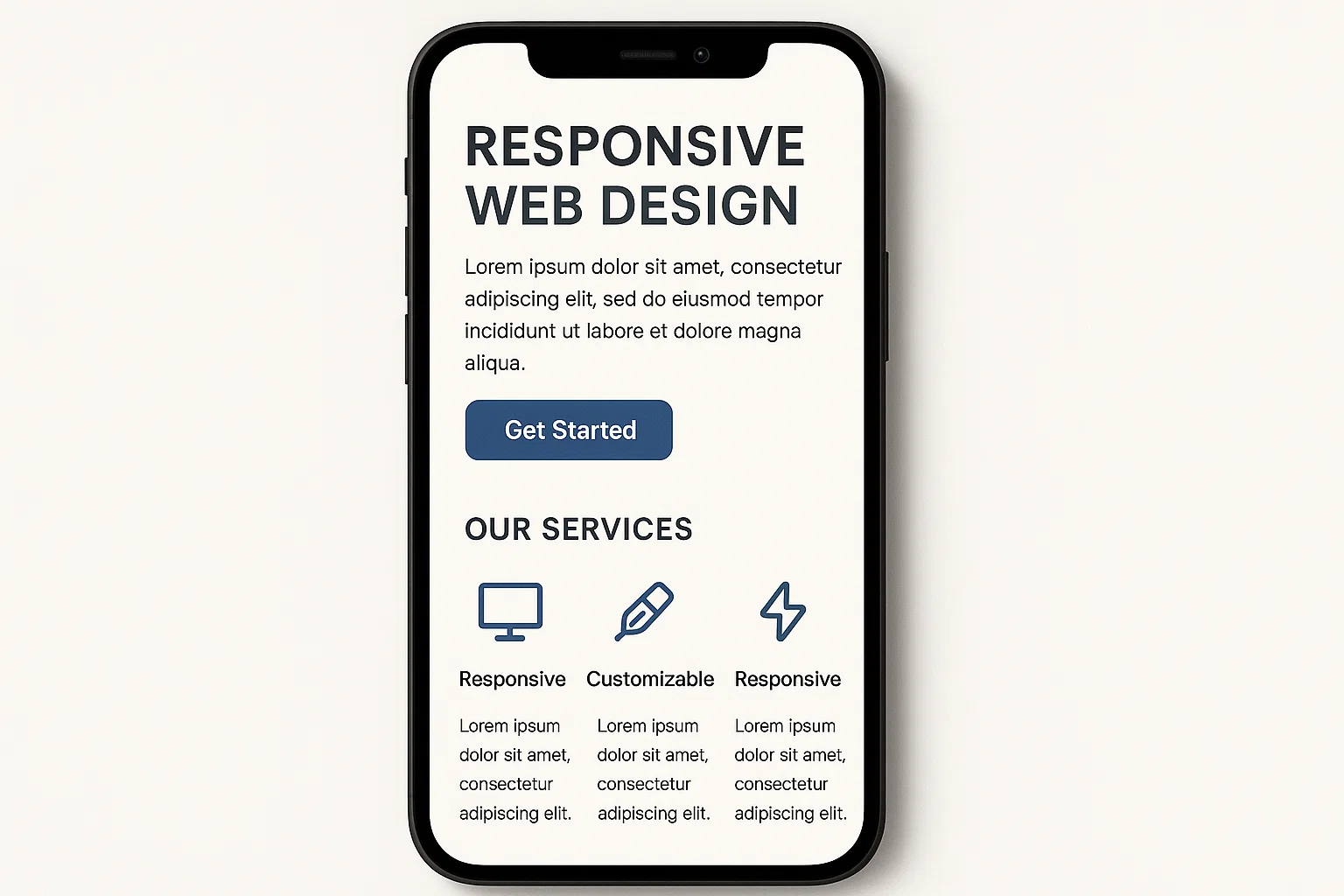
Mobile-responsive design refers to a web development approach that creates websites that automatically adjust their layout, images, and functionalities to provide an optimal viewing experience across all devices. Whether someone visits your site on a desktop computer, tablet, or smartphone, a responsive design ensures that your content remains accessible, readable, and easy to navigate.
This isn’t about creating a separate mobile version of your website. Instead, responsive design uses flexible grids, scalable images, and CSS media queries to create a single site that adapts seamlessly to any screen size. The result is a consistent brand experience that meets users wherever they are, on whatever device they’re using.
The Business Impact of Mobile Responsiveness
The consequences of neglecting mobile optimization extend far beyond aesthetics. When potential clients land on a non-responsive website from their mobile device, they encounter frustrating experiences: text that’s too small to read, buttons that are impossible to tap accurately, and images that don’t load properly or extend beyond the screen boundaries.
Research shows that 53% of mobile users will abandon a website if it takes longer than three seconds to load. Furthermore, 57% of users say they won’t recommend a business with a poorly designed mobile site. These statistics translate directly into lost revenue and missed opportunities for service-based businesses that rely on their website to generate leads.
Google recognized this shift in user behavior years ago and now uses mobile-first indexing as its primary method for crawling and ranking websites. This means that Google predominantly uses the mobile version of your content for indexing and ranking. If your mobile experience is subpar, your search engine rankings will suffer accordingly, making it even harder for potential clients to find you.
Enhanced User Experience Drives Conversions
Mobile-responsive design isn’t just about preventing negative experiences—it’s about creating positive ones that convert visitors into leads. When users can easily navigate your site, read your content without zooming, and interact with your calls-to-action without frustration, they’re significantly more likely to complete desired actions like filling out contact forms, requesting quotes, or scheduling consultations.
Consider the typical user journey on a mobile device. Someone might discover your business while commuting, during a lunch break, or while researching solutions from their couch at home. These users often have limited time and patience. A responsive design that loads quickly, presents information clearly, and makes it effortless to take the next step respects their time and increases the likelihood of conversion.
The touch-friendly nature of mobile-responsive design also plays a crucial role. Buttons and links need adequate spacing to prevent mis-clicks. Forms should be simplified and easy to complete on smaller screens. Contact information should be clickable, allowing users to call or email with a single tap. These seemingly small details create a frictionless experience that guides users naturally toward becoming leads.
Competitive Advantage in Your Market
In many service industries, your competitors may still be operating with outdated, non-responsive websites. By investing in mobile-responsive design, you immediately differentiate your business and signal to potential clients that you’re modern, professional, and attentive to their needs.
This competitive advantage extends to how clients perceive your business credibility. A website that functions flawlessly on mobile devices suggests that your business is established, trustworthy, and capable of delivering quality service. Conversely, a clunky mobile experience can raise doubts about your professionalism before a potential client even contacts you.
Cost Efficiency and Future-Proofing
While creating a mobile-responsive website requires an upfront investment, it’s far more cost-effective than maintaining separate desktop and mobile versions of your site. Responsive design means you’re building and updating a single website that works everywhere, reducing long-term maintenance costs and complexity.
Additionally, responsive design future-proofs your online presence. As new devices with different screen sizes enter the market, your responsive site will automatically adapt without requiring complete redesigns. This flexibility protects your investment and ensures your website remains effective as technology evolves.
Implementation Best Practices
Creating an effective mobile-responsive design requires attention to several key elements. Page speed optimization becomes even more critical on mobile networks, which may have slower connection speeds. Compressing images, minimizing code, and leveraging browser caching all contribute to faster load times.
Navigation should be simplified for mobile users, often using a hamburger menu that expands when needed. This approach keeps the screen uncluttered while still providing access to all necessary pages. Similarly, content should be prioritized, with the most important information appearing above the fold where users are most likely to see it without scrolling.
Forms, which are essential for lead generation, require special attention on mobile devices. Long forms can be overwhelming on small screens, so consider breaking them into multiple steps or reducing the number of required fields. Ensure that form fields are large enough to tap easily and that keyboard inputs are optimized for the type of information requested.
Measuring Mobile Performance
After implementing responsive design, it’s essential to monitor how mobile users interact with your site. Google Analytics provides detailed mobile metrics, including mobile traffic percentages, bounce rates by device, and mobile conversion rates. These insights help you identify areas for improvement and measure the ROI of your mobile optimization efforts.
Heat mapping tools can reveal how mobile users navigate your site, where they tap, and where they lose interest. This information is invaluable for refining your mobile experience and maximizing lead generation potential.
Conclusion
Mobile-responsive design is no longer optional for service-based businesses serious about lead generation. With the majority of web traffic coming from mobile devices, a responsive website is essential for reaching your target audience, providing excellent user experiences, maintaining competitive advantage, and achieving your business growth goals. The investment in mobile optimization pays dividends through increased traffic, improved search rankings, higher conversion rates, and enhanced brand perception. In a mobile-first world, responsive design isn’t just about keeping up with technology—it’s about meeting your clients where they are and making it as easy as possible for them to choose your services.